Get GutenLayouts Lifetime Deal
How to Create a Content Slider in Gutenberg
Creating a content slider in the Gutenberg block editor is challenging, but the GutSlider block plugin has simplified the process. As a result, you can easily create a content slider with amazing animations in your favorite Gutenberg block editor.
In this blog post, we will discuss step-by-step guidelines for creating a content slider in Gutenberg. So, if you are looking for an instruction to build a content slider, just follow this article.
GutSlider: Best Block Slider
Finding the best block slider plugin can be complicated. We studied multiple plugins and finally found GutSlider, which is powerful, highly customizable, and optimized.
However, here are the key features that allow you to understand why we have chosen the GutSlider for creating a content slider in Gutenberg.
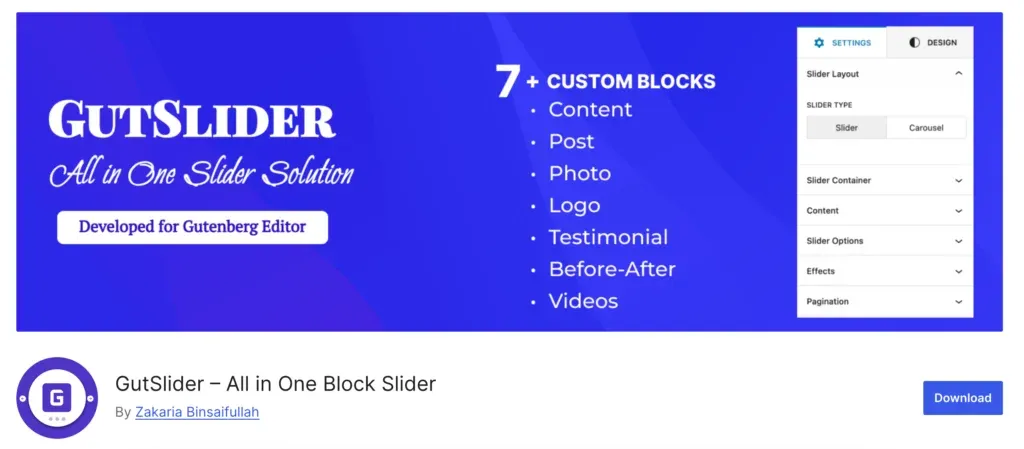
Key features
- Drag-and-Drop Interface: Easily add and arrange content within sliders without any coding.
- Responsive Design: Ensures that sliders adapt smoothly to different screen sizes and devices.
- Powered by Swiper JS: Provides reliable, lightweight slider functionality without jQuery dependencies.
- Highly Customizable: Includes various settings for slide transitions, timing, animations, and styles.
- CSS Animations: Supports smooth animations and custom delays for a polished visual experience.
- Optimized Performance: Scripts only load on pages where the block is used, enhancing site speed.
- Supports Multimedia: Add images, text, videos, or any type of content into the slider.
- Intuitive Settings Panel: Easily control the number of slides, slide navigation, pagination, and more.
- Seamless Gutenberg Integration: Built natively for the Gutenberg editor for a smooth user experience.
- Lightweight and Fast: Minimal resource usage ensures fast load times and performance.
Installation and Activation
The gutSlider block plugin’s installation process is straightforward. It is similar to other WordPress plugins’ installation and activation processes. To install and activate the GutSlider plugin, follow these steps as shown in the image:
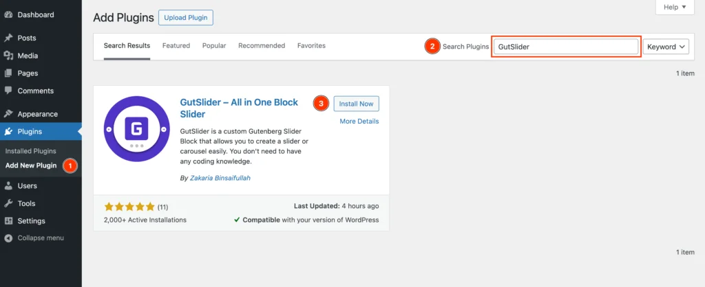
- Access Plugins Menu: Go to the WordPress dashboard. Click on Plugins in the left-hand menu.
- Add New Plugin: Select Add New from the Plugins sub-menu. Search for GutSlider: In the Search Plugins box, type GutSlider.
- Install Gut Slider: Find the plugin named GutSlider in the search results. Click the Install Now button next to it.
- Activate the Plugin: Once installed, click Activate to enable the plugin on your site.
Insert Static Block in Gutenberg Editor
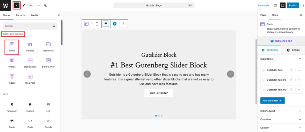
GutSlider comes with several custom blocks for the complete solution for different types of carousels and sliders. Since our target is to create a content slider, we can pick the Static block from the list.
To add the Static block, follow the following steps:-
- In the block menu on the left, navigate to the GUTSLIDER BLOCKS block category.
- Click on the Static block from the list to add it to the Gutenberg editor.
If you complete these steps, you will see the default sliding interface.
Add or Remove Slide Item
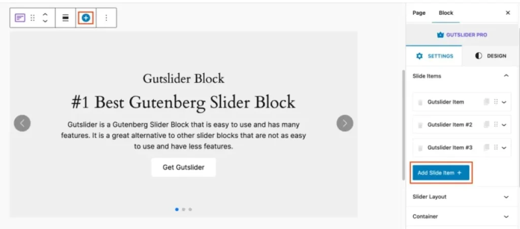
By default, the Static block includes 3 slider items. But no worries, you can either add or remove any item as per your wish. Let’s explore how we can add and remove slider items from the list.
Add New Slide Item
Here is a list of descriptions about the “Add Slide Item +” button:
- Adds a new slide to the slider: When you click on this button, a new slide will be added to the slider.
- Opens the slide editor: When you click on this button, the slide editor will open, allowing you to edit the content of the new slide.
- Is located in the slide editor toolbar: The “Add Slide Item +” button is located in the slide editor toolbar, which is located at the top of the slide editor.
Delete Slide Item
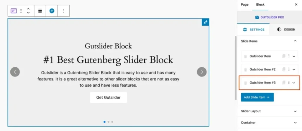
Here is a list of descriptions about the “Delete Slide Item“: To delete a slide, click on the “Delete Slide Item” button in the slide editor toolbar.
Change Slide Content
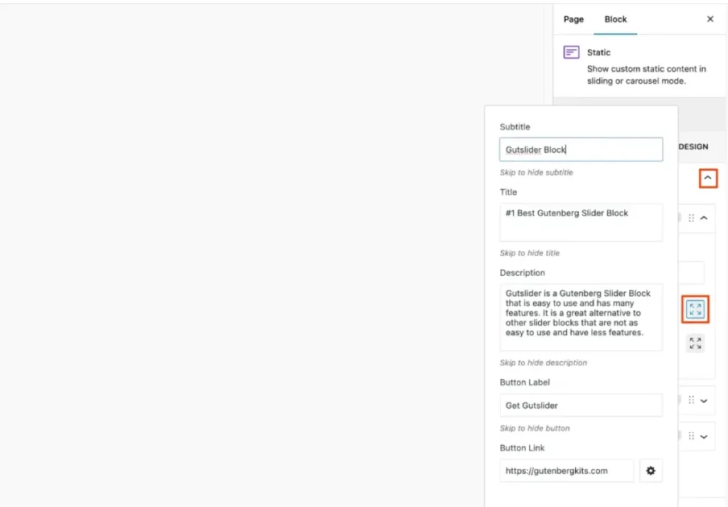
The Static block provides different content elements, for example, subtitles, titles, descriptions, buttons, and images. To add slide content, you have to open each slide item and expand the popover to add the contents and background image, including overlay.
- Subtitle: A smaller heading to provide additional context.
- Title: The main heading to grab attention.
- Description: A brief explanation or highlight of the slide content (e.g., “Gutslider is a Gutenberg Slider Block that is easy to use and has many features…”).
- Button Label: The text on the call-to-action button (e.g., “Get Gutslider”).
- Button Link: The URL where the user will be directed when clicking the button (e.g., “https://gutenbergkits.com”)
Change Content Background
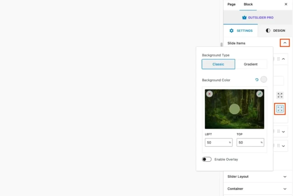
Static block has support to add content background and overlay. You can either have a solid color background or an image, even if you want, you can also add a gradient color background for your content slider.
So, to add the content background, you have to expand the popover to see the all background settings. It looks like the following screenshot:
- Background Type: Classic: Choose a solid color for the background.
- Gradient: Select a gradient background, configuring the start and end colors as well as the direction of the gradient.
- Enable Overlay: Toggle this switch to add an overlay to the background. When enabled, you can choose between Classic and Gradient overlays.
- Overlay Color: Select the color for the overlay from the color palette or enter a custom color code.
- Overlay Opacity: Adjust the opacity of the overlay using the slider, allowing you to control how much of the background shows through.
Slide Layout Options
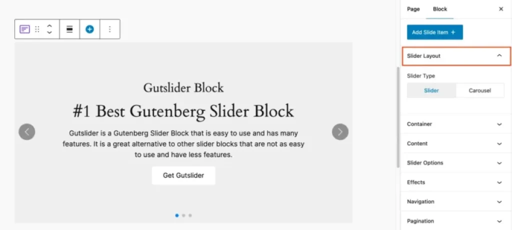
Gutslider Static Block comes with two types of slider layouts. You can either create the slider or carousel layout. Since we want to create a content slider, so make sure you have selected the Slider type.
Slider Options
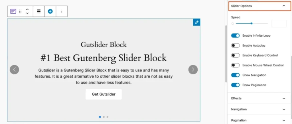
GutSlider provides all essential slider options so that you can customize the settings and create a perfect slider for you. Here are the slider options:
- Infinite Loop: Allows the slider to continuously cycle through slides without stopping.
- Autoplay: Automatically plays the slides without needing user interaction.
- Keyboard Control: This lets users navigate the slider using keyboard keys that improve accessibility.
- Mouse Wheel Control: Users can scroll through slides using their mouse wheel.
- Navigation: You can either show or hide the navigation for the slider.
- Pagination: You can either show or hide pagination and control different pagination types.
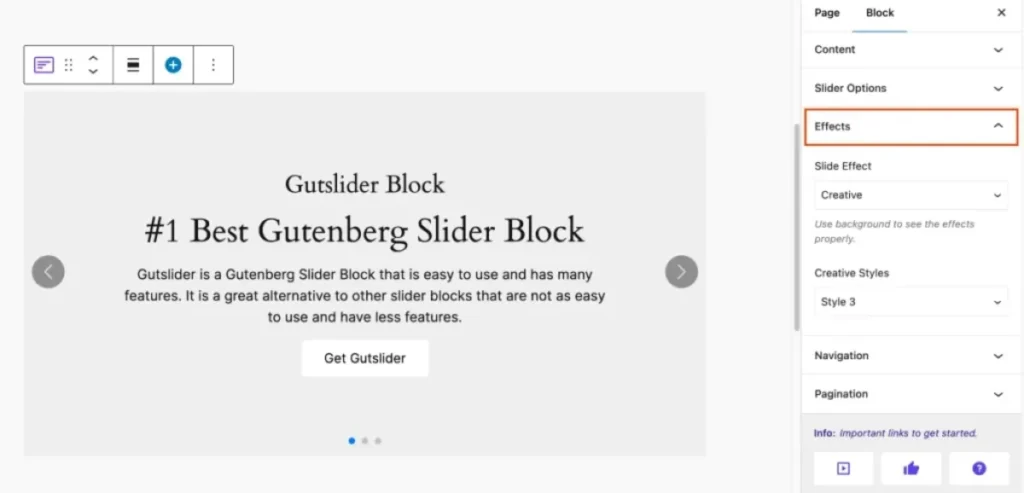
Slider Effect
Slide Effect is the term used to describe the visual transition style used in the slider between slides. It lets users select imaginative effects, improving the slider’s overall look and usability.
- Flip: Gives a 3D flip transition between slides.
- Fade: Smoothly transitions the opacity of the slides for a subtle effect.
- Slide: Moves the slides horizontally or vertically for a classic sliding effect.
- Cube: Creates a 3D cube effect, rotating slides like sides of a cube.
- Coverflow: Overlaps the slides slightly and shifts them, mimicking a cover flow animation.
Slider Navigation
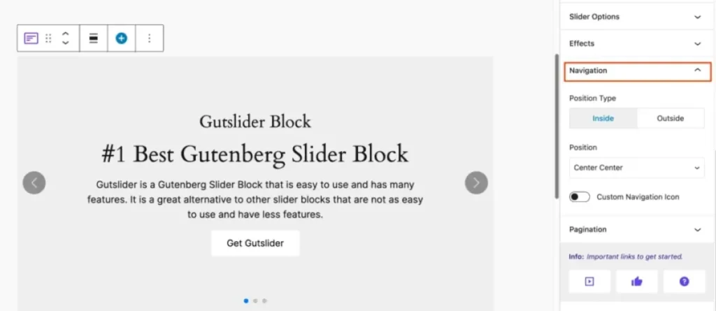
The navigation style specifies the design and operation of a website’s navigation system to guarantee a smooth user experience.
- Position Type (Inside/Outside): This option defines where the navigation arrows (the left and right arrows for sliding) will appear about the slider content.
- Inside: This places the arrows within the main slider area, giving a more integrated look.
- Outside: The arrows appear just outside the slider’s border, allowing more focus on the content without overlapping the arrows.
- Position (Center Center): This dropdown option allows you to set the exact positioning of the navigation arrows within or around the slider. For example, “Center Center” means the arrows are centered vertically and horizontally relative to the slider.
- Icon ON: When turned ON, the navigation icons (like arrows) will be replaced with your uploaded custom icons, allowing for a personalized look.
- Icon OFF: When turned OFF, the navigation icons will remain as the default icons, without any customization.
Slider Pagination
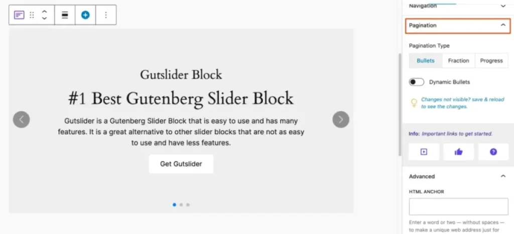
The technique of pagination divides content into distinct pages so that users can access and navigate information in digestible chunks.
- Bullets: Small dots representing each slide.
- Numbers: A numeric representation of the slides.
- Progress Bar: A visual bar that fills as you progress through the slides.
- Dynamic Bullets ON: Bullets adjust to show the current slide.
- Dynamic Bullets OFF: Bullets remain static.
Customization
Gutslider is highly customizable; it allows you to customize everything you need. You can add custom style and animation for any type of content element, like title, subtitle, description, or button. It offers the following customization options:-
- Animation: Choose from eight different animations to add some dynamic flair to your content.
- Color: Adjust the color of your text to make it pop or match your theme.
- Background: Customize the background color of your button for the desired look and feel.
- Typography: Customize every aspect of your text’s appearance, including:
- Font Size: Set the size of your text.
- Font Family: Choose the typeface.
- Font Weight: Adjust the boldness.
- Font Style: Italicize, oblique, or keep it normal.
- Text Decoration: Add underlines, overlines, or strikethroughs.
- Text Transform: Control the capitalization of your text.
- Spacing: Adjust the padding and margins on all sides for perfect placement.
- Width: Adjust the overall width of the slider block.
- Height: Set the height of the slider block.
- Icon Size: Control the size of the icons within the slider.
- Border Style: Choose from different border designs like solid, dotted, or dashed.
- Border Radius: Adjust the roundness of the button corners to create either sharp or smooth edges.
- Padding: Control the space inside the button, between its border and the text.
- Margin: Adjust the space around the button to position it perfectly within your layout.
Conclusion
I hope you have enjoyed this blog post that helps you to create the content slider in the Gutenberg editor easily. This type of animated content presentation will improve your site’s interactivity and draw your client’s attention. Feel free to reach out to get any help.


